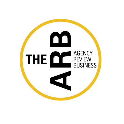
ARB identity
The Agency Review Business (ARB) help advertisers derive better value from media and research budgets. We were commissioned to create a brand identity and website that would help establish the ARB as experts in their field.
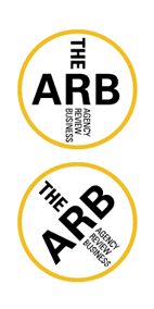
The identity is based around a logo that can be read vertically, horizontally and diagonally. The logo contains the abbreviated name and full name into a single element without losing clarity. The result is a ‘stamp’ that is applied easily across online and printed materials.
The logo was carefully composed in precise detail so as to not become claustrophobic or messy. The Univers typeface, particularly its condensed weights, was chosen for its authoritative feel and because it reproduces well at small sizes.
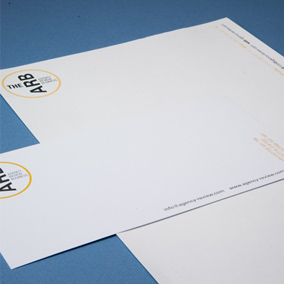
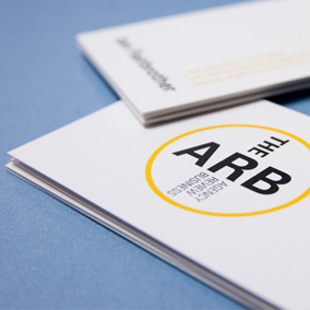
The rich gold colour resonates in print, creating an immediacy and implying strength and confidence, while the stationery takes advantage of the multi-directional logo, with address and contact details also rotated.
More The ARB
The ARB website
Spacious Flash website for The ARB.
AMD identity
It’s all in the D.
Coverup identity
Tessellating identity for book accessory.
VuCall identity
Who says you can't be figurative while being abstract?
Legal & Privacy
© 2010–2026 Igloo