EIP identity
We were commisioned to create business stationery for EIP, and generally manage a more consistent, coherent identity.
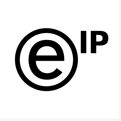
While the logo itself was to be kept, we redrew it, refining its proportions and adjusting the tail of the ‘e’.
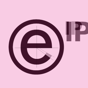

We enlarged the I and P in keeping with its importance in the company name, and aligned them optically with the ring. The ‘sticky-out’ tail of the ‘e’ was a little too quirky and so was refined.

A lock-up accomodating an explanatory slogan was developed for use on stationery.
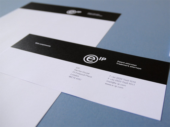
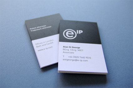
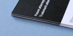
The EIP stationery and business cards.
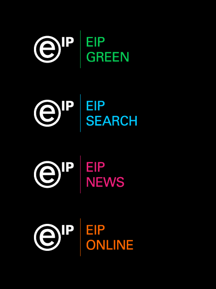
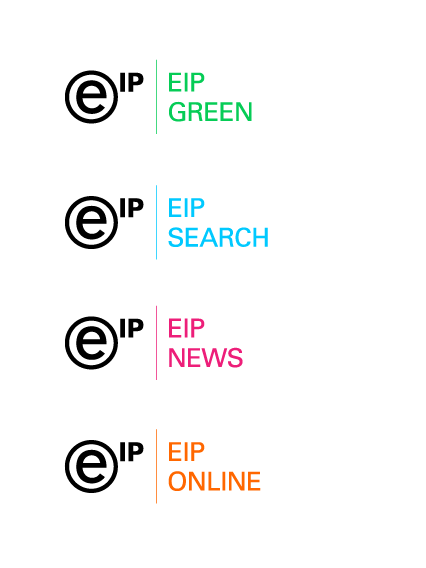
We devised a way in which sub-company logos would be used. In order to retain the main logo’s character, and to give each a sense of separation, we opted to set the sub-names in a different typeface.
With future applications in mind, colours were picked for each subcompany that worked equally well on black and white backgrounds.
More EIP
EIP website
Signalling the end for pale blue laywer websites.
The ARB identity
Omnidirectional logo system for media initiative.
AMD identity
It’s all in the D.
Coverup identity
Tessellating identity for book accessory.
Legal & Privacy
© 2010–2026 Igloo