
HMT identity
HMT is a group that runs three private hospitals around the UK.
We were asked to devise a large scale identity system for the main group itself and the individual hospitals.
The logo brings together modern, clean typography and a four-colour abstract symbol.

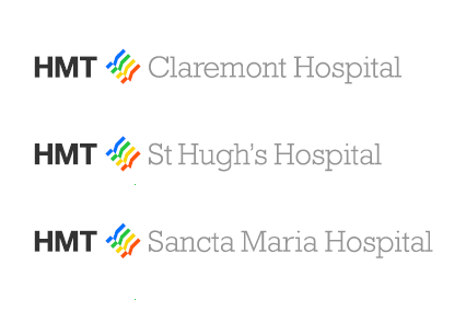
The 'flag' symbol, while being deliberately non-literal, implies resurgence, positivity and improving health. It is intended for use as a separate element in various communications and documents.

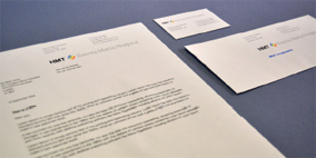
We created an extensive brand guidelines document that introduces the new identity and will help to maintain a consistent visual approach across all materials.
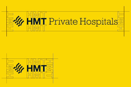
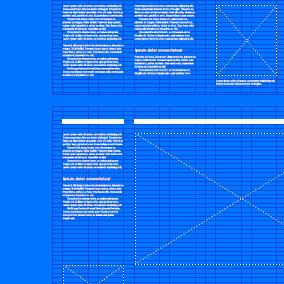
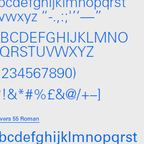
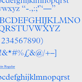
The document recommends best usage of logo, typography, layout, colour and imagery.
More HMT Hospitals
HMT Hospitals print
Twelve page brochure for HMT St Hugh's Hospital.
HMT Hospitals website
Clean, ordered site for hospital.
Get In The Back Of The Van identity
Logo for theatre collective.
Frui identity
Window on the world for holiday company.
EIP identity
Logo refinement, application and stationery.
Legal & Privacy
© 2010–2026 Igloo
